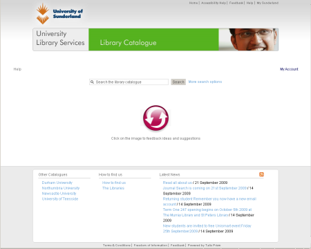
Talis Prism 3 at the University of Sunderland
The University of Sunderland Library has made its Talis Prism 3 catalogue available as a pre-launch beta option via a link from the current Prism 2 catalogue.
Running the two versions of the catalogue in parallel is the ideal way to introduce Talis Prism 3. It allows users to experience the new catalogue without disrupting familiar options, and it has no extra overhead for your system or library staff. Introducing Talis Prism 3 at this point in the academic calendar is testament to this.
In addition to the benefits of the discovery and navigation features of Talis Prism 3 it has the flexibility for extensive design and styling, which in this case has been done by the library. They have been able to style the new catalogue to match the rest of the web site, making it feel integrated. This is further enhanced by the ability to easily include quick links to other library services and to display other information such as opening hours.
For the time being the library has opted to not display cover images. The layout of entries on the page has been adjusted accordingly.
The ability for the user to send a feedback message is an important and well used feature of Talis Prism 3, giving invaluable insights into the user’s experience. The University has supplemented this with a link to their library feedback form, and we look forward to the reception from users.


October 12th, 2009 at 10:07 am
I wondered if anyone from Sunderland would be able to comment on why the decision was taken not to include cover images?