Prism Blog

Archive for the 'mobile' Category

Admin Console Release – 26th March 2013

I’m pleased to announce that the Admin Console refresh that we have been previewing in recent webinars has now been released into the live service.

This release is primarily to support the migration to Capita Infrastructure, ensuring a seamless transition as tenancies are migrated. While we’ve aimed for feature-parity with the previous Admin Console, we’ve also taken the time to add a few new features:

  • Account settings section to change password and enable optional two-step verification for accounts
  • Context-sensitive help

New account settings

The Admin Console refresh has a new “Account settings” section where you can change your password, enable two-step verification and register your email address. We will be gradually expanding this area in upcoming releases to support sub-accounts and access control lists to restrict users to certain functions.

To further increase the security of your accounts, you may now opt-in to two-step verification. This uses a mobile application to generate a 6-digit code that must be supplied when logging in. There are several apps available for smartphones, including:

To opt-in, go to the “Account settings” section and click on the “Change” link next for “Two step verification”:

Enabling two-step verification

This will open a wizard that will guide you through setting up your account, and authentication device. A backup code is also provided to allow access to your account in the event of a lost phone or device.

Context sensitive help

We’ve gone through the different sections of the Admin Console and ensured that there is explanatory text available, where required, to help guide you through some of the more complex configuration options.

Context sensitive help bubble

In addition to this, we’re producing several introductory videos focusing on specific areas and tasks within the Admin Console. We’ll post some more information when these are available.

We welcome your comments, questions and ideas on Admin Console features. You can post comments here on the blog, discuss topics in the Prism forum, raise, discuss and vote on ideas in Prism Ideas or contact your Account Manager.

Watch the latest Prism Development webinar

If you were unable to attend one of our recent Prism 3 update webinars, then catch up on latest developments by watching the recording below or by downloading the video.

Agenda

  • Prism Roadmap overview
  • Summary of the last Prism release, with a look at Admin Console changes, and ratings
  • Next steps on the roadmap
    • List sharing
    • Fix to title handler for semicolon
    • Development of ‘is reservable’ for context sensitive button
    • Augmented discovery
    • Domain name change
  • Enabling the Mobile interface

[podcast format=”video”]http://talis-videos.s3.amazonaws.com/prism_webinar_130212.mp4[/podcast]

Going live with the new Prism Mobile Interface…

Congratulations to the University of Sunderland and Rotherham Libraries who have just gone live with the new Prism 3 Mobile Interface.

imageYou can take a look at their Prism Interface on your mobile device now, by following the links below:

Rotherham Libraries

University of Sunderland

Rachel Westwood, Internal Account Manager at Capita, also talked about the University of Sunderland and Rotherham Libraries going live in the ‘Introducing the Prism Mobile Interface’ webinar this week. If you missed the webinar you can watch a recording of it here:


[podcast format=”video”]http://talis-videos.s3.amazonaws.com/prism_mobile_interface.mp4[/podcast]

We are delighted that the mobile interface is being so well received by Prism 3 customers who have welcomed this important development. Glyn Sinar from Lancashire Library and Information Service described it as “a really positive and useful development.” He also added “This is an area which will really push our libraries forward in the eyes of the public”.

To get this feature enabled on your catalogue, please raise a support case.

Prism release – 21-September 2011

I’m pleased to announce the release of the latest version of Prism to the live service last night. This version has been available for preview since 5th September and was described in detail in the preview release notice. The main inclusions are:

  • Prism Mobile Interface, making your Prism catalogue into a mobile ‘web app’, optimised for viewing on all modern smart phones
  • Improvements to CSS for themes, optimising performance
  • Support for additional LDS authentication methods
  • Tiny images on account pages, for more items displayed per screen

The Mobile Interface requires a modification to the tenancy configuration and we recommend you test this on your sandbox tenancy before putting it live. If you raise a service request we will add the configuration to your tenancy as soon as possible.

The improvements to CSS for themes will be switched on together with the Mobile Interface. It is being managed this way because there may be some issues with the display arising from the interaction with your local customised styling. Introducing it on the sandbox tenancy first, together with the Mobile Interface, will allow any such issues to be addressed before putting it live.

You can read much more about the Mobile Interface and the CSS improvements in the posts on Mobile interface configuration and Prism 3 calling: introducing our mobile device interface

If you have any comments, questions or suggestions on this release please get in touch; you can comment here or on the forums or Prism Ideas or contact your account manager or the Prism team directly.

Prism 3 calling! Introducing our mobile device interface…

At the beginning of the month we released the latest exciting development for Prism 3, our mobile device interface. We have made this available to you, our valued customers, as part of your Prism 3 subscription at no extra cost.

This development comes at a crucial time as mobile technology advances at a breathtaking rate and a recent study by Ofcom1 found that 91% of the population now own a mobile device.

The interface works with all the main mobile device browsers including iPhone, Android, Opera Mobile/Mini, Windows Phone 7 Mango and the latest Blackberry versions. This is important considering that “Every four weeks about 2.5% of feature phone owners have shifted to smartphones since April 2010 in the UK” suggesting that “the ‘tipping point’ when smartphones make up half of all users lies about a year away, in June 2012.” 2
 

There are lots of features that will benefit your users including:

Adaptive design
Prism 3 will detect the device being used and automatically render in the mobile interface which automatically adapts to the size of the screen available.
Users don’t have to download it; it’s not a native app, and no separate URL is required meaning seamless use alongside the desktop version for your users. We have deliberately transformed the existing interface and built on existing information rather than create an unfamiliar environment.


Home screen icons
On devices where home screen icons can be created, (i.e. for apps that are downloaded) home icons can be created on the Prism Mobile Interface. Users can create as many home screen icons for Prism as required allowing users to organise their searches. For example, a different icon could be created for subjects, locations, media types, new stock – anything that the library provides – a great time-saving feature.

Touch- swipe paging and tap to reveal
Where the device permits it, the Mobile Interface has been designed to allow touch-swipe paging and tap to reveal. This means that users can operate their devices in the way that they are accustomed to and don’t have to resort to using clumsy navigational functions. For example, by ‘tapping’ on a book jacket image, more holdings information is revealed.

Focus on key tasks                                                                                                            People are generally far less tolerant of clutter on mobile devices and so the Prism Mobile Interface has been designed to only display key information and tasks. This ultimately means an improved experience for the user as they find the answers they need quicker and easier.

Faster searching
Caching pre-loaded searches and the use of the latest features of HTML5 mean that the interface is much quicker and responsive for the user. Additionally, search results are pre-loaded in the background so it feels instantaneous when you click or swipe through different pages of results.

To get this feature enabled on your catalogue, please raise a support case and to see the preview webinar that was held by our senior Prism 3 developer Matt Machell on 22nd August, click here.

1UK Sees Highest Growth in Smartphone Users (Ofcom, 2010):  http://blog.rightmobilephone.co.uk/uk-sees-highest-growth-in-smartphone-users/

2Arthur, C. ‘Smartphones head to tipping point’, Guardian (11 July 2011): http://www.guardian.co.uk/technology/2011/jul/11/ios-android-blackberry-smartphone-data


Mobile Interface Configuration

This post is an addendum to the existing Prism 3 Design Guidelines focusing on the new features that come as part of the mobile interface and its related release.

Enabling the Mobile Interface

Currently, because it requires checks with theme compatibility, mobile is turned on by sending a service request to the Help desk. We will

Turning the interface on by default has two effects: enabling the mobile interface and enabling html5.
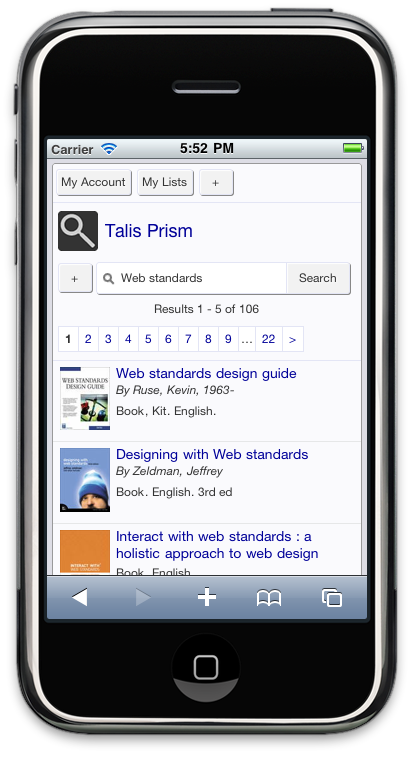
Mobile Interface

When enabled, the main effect of the mobile interface is that it will add extra CSS that overrides existing themes when in a mobile context. These changes are adaptive, which means that when you size a modern browser like Chrome or Firefox or IE9 to the targeted window size the mobile interface will come into effect.

Extra features are also enabled such as swipe-based paging and background loading of search results. However, these feature rely on modern HTML5 features that are only available in recent browsers and so may not be present if you view the page on an older desktop browser; Prism will still work as normal though.

Note: Because of the way the mobile interface overrides styles, the system will strip out !important declarations as these may prevent those overrides.

HTML5

The Prism mobile interface makes use of a number of features from the new version of HTML (the markup language of the web). Since we’re using these modern features, we’ll switch the DOCTYPE to indicate HTML5.

This has the additional bonus of forcing Internet Explorer 6 to use its standards rendering mode, which means it behaves more like modern browsers. This may mean you find themes designed assuming IE6 quirks mode may look odd. Fortunately the new release also has some additional features designed to help targeting older versions of Internet Explorer, see CSS Browser Targeting below, allowing much easier targeting of corrective measures.

Customising the Mobile Interface

The mobile interface is a series of additional stylesheets and behaviours for small devices. It aims for a more “app-like” feel, which focuses on core tasks and their requisite elements of the interface, often hiding extra detail behind reveals to optimise for the small screen size.

Because mobile is a more fragmented space than desktop, where slight changes can have major impacts you might not see on one particular phone, the mobile interface has a more restricted set of configuration options. This makes the theme more reliable across devices and enables us to fix in one place rather than across multiple tenancies.

Configuration is achieved by creating a file called config.ini that you upload as part of your theme files via the admin console. It goes in the base of the theme so you can update it as a single file without re-uploading the entire theme. Rather than write CSS rules it allows you to specify parameters that we turn into CSS for you. This means you don’t have to worry about browser inconsistencies, since we handle that for you.

A config.ini looks like this (note lines may wrap and {tenancy} should be replaced with your tenancy):

;this is a comment...
 [Mobile]
touch_icon = //prism.talis.com/{tenancy}/assets/-/images/start_icon.png
mobile_header_background = //prism.talis.com/{tenancy}/assets/-/assets/images/mobile_header.png
mobile_form_element_border = #E3E5F5
mobile_form_element_background = #fff
mobile_form_button_background = #fafafa
mobile_tag_background = #D2E3FF
mobile_tag_border = #80B2FF
mobile_tag_text_colour = #333
mobile_text_colour = #222
mobile_link_colour = #28489D

You can create this file in Notepad or any other text editor, simply make sure it is saved with the .ini extension. The initial set of configurable parameters is conservative and allows for form element styling, facet/tag styling and main text colouration. It also allows you to specify the background image for the application title and the touch icon used when creating a shortcut icon on iPhone/iPad.

The web addresses for these image should be full urls, with a protocol independent uri so they work under both secure and insecure connections. Note the lack of http: prefixing the web addresses used, for example:

//prism.talis.com/{tenancy}/assets/-/images/start_icon.png

The sizes for iOS start icons are 57×57 pixels. You can learn more about these on Apple’s Developer Site.

You may also want to specify a custom background for the application header. This sits at the top of all pages in the mobile interface behind the main application title. It should be 50px high, by a maximum of 470px wide. Note that the 470px is a maximum and that the image will be truncated on smaller screens. Also note that the icon shown by default is 40px by 40px, so if you want to substitute in your own this is the size to use.

Extra Links

Mobile hides header and footer fragment detail to save space and focus on the core functionality. There may be items, such as links to terms and conditions, that you are required to include a link to and wish to re-instate on mobile. Be cautious of what you choose to add, since it is far easier to overload the interface on a mobile device than on a desktop.

The best option for adding such extra links is to add this to the headerlinks.html fragment as a menu item, giving it the class of mobile. This will hide it on desktop devices, but place it in the openable menu on the top of the screen should access be needed:

For example:

<ul>
    <li class="mobile"><a href="{url}mobilehelp.html">Mobile Help</a></li>
</ul>

Javascript Extensions

If you make use of any extensions to the Prism interface, image carousels or similar via either Juice or jQuery, you may wish to disable these when mobile is enabled as they may cause slowness due to extra network requests and more involved scripting.

You can set these to not run when mobile is enabled by checking the PRISM.mobile object property in Javascript. This is set to true when the main window is smaller than the 480px that triggers the mobile interface. You can then turn of features that aren’t suitable to run in a mobile context.

if(PRISM.mobile){
 //code to run mobile essential extensions
 }
 else{
 //code to run normally
 }

You could also modify how Juice is included in the page to use this too, reducing your downloads on mobile devices even further. So for example, the following could be added to your javascript.html fragment:

<script type="text/javascript">
    $(function(){
        if(!PRISM.mobile){
                $('body').append('<script type="text/javascript" src="http://prism.talis.com/{tenancy-name}/assets/-/juice.js"></script>');
            }
    })
</script>

This would only include the juice.js file if mobile is not enabled.

If you are using extensions, we recommend you move to using the version of jQuery bundled with Prism, to avoid downloading the same library multiple times.

Additional Features

The release with mobile also includes a number of additional features that improve the handling of CSS.

CSS browser targeting

The new release includes a more robust method of targeting older versions of Internet Explorer with CSS rules to account for browser quirks. By prefixing a CSS selector with a particular class you can target older versions of the browser with specific fixes. For example:

 .item{
 width:98%;
 }
.ie6 .item{
 width:100%;
 }

would declare a normal width on newer browsers of 98%, but force IE6 to set the width to 100%. This method prevents the use of ugly and problematic “CSS hacks” that can cause unexpected behaviour.

CSS Merging

The new CSS handler features a number of improvements to the way CSS is served to the browser.

Firstly we merge the files together, reducing network requests. Where previously we linked to three files base.css, site.css and print.css, these files are now wrapped together as one, with the mobile interface included as well if enabled. This merged file has a url of assets/{etag}/merged.css , which means it looks like it’s in your theme so existing image references work.

When this file is served it is sent with far future expiring cache headers which means that the file will always be cached, reducing requests for large CSS files and speeding your catalogues display. If you change your site.css or config.ini, or we release a new version of Prism, the file’s web address changes automatically so the updated CSS will be downloaded.

Note: Because we now merge CSS, if your theme uses @import rules, which must appear at the top of the file to work. These will now need to be actually included in the site.css file. This is best practice as it allows us to reduce network requests and force caching.

Interface Labels

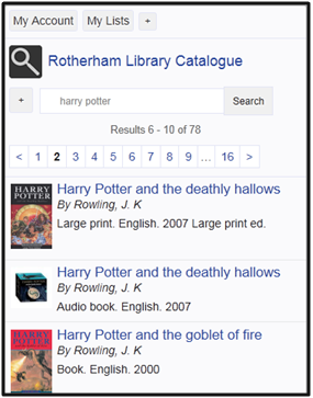
Mobile makes use of several interface labels that have previously been hidden (the main application title) or are new (mobile introductory text). These can be customised as with any interface label in Prism. The default for application title is “Talis Prism”, but you may prefer a shorted version of your institution name with “Library Catalogue” added. Please raise a service request with the required text and we will configure it for you.

Prism 3 mobile interface

At the end of August we will be releasing the Prism 3 mobile device interface to demo. It will then be released to live in mid-September. This new feature has been built specifically in the mobile device context – only a small screen area, and a need for immediate and quick answers.

Some of the front end features that will benefit users include touch-swipe paging and a home screen icon, allowing the mobile interface to be more app-like. The URL for your catalogue will also remain the same; Prism 3 will detect the device being used and automatically render in the mobile interface. Some new web browser features, including caching pre-loaded searches and use of HTML5, allow the interface to be much quicker and responsive for the user.

Our senior developer on Prism 3, Matt Machell, explains these and other features in more detail in this recording of the latest Prism 3 mobile interface webinar. To get this feature enabled on your catalogue when it goes into demo, please raise a support case.

[podcast format=”video”]http://talis-videos.s3.amazonaws.com/mobile_interface.mp4[/podcast]

Prism 3 mobile interface – an introduction

Prior to the release of the Prism 3 mobile interface we are holding a webinar to preview this latest enhancement. The webinar will be held on 22 August at 11.00am. This introduction to the mobile interface will provide opportunity to understand how the mobile interface will work, how it will be used and give you the chance to ask any questions you may have. Register your free place now.