As shown on the roadmap, we’re aiming to release changes to the display of availability information around the end of March. These changes are centered on making the availability information much simpler to comprehend by reducing the amount of information people have to scan over. We’re also using the opportunity to provide more information, most notably individual item barcodes so often requested by frontline staff.
So we want to add features, but reduce complexity, how are we going to manage that? In all of our design thinking for Prism 3 we are well aware that users display very different levels of comfort with computers and with Prism 3. This comes from the frequency and degree to which Prism 3 is used. At one end of the spectrum we have first-time and infrequent users and at the other daily users and staff. The regular users often spot features that could make the use of Prism 3 in a specific situation more helpful and those are often great ideas. Every feature added to a piece of software makes it more complex to use, so we are always treading the line between making Prism 3 more useful in a specific situation and making it more difficult for everyone the rest of the time. While just one small feature may not seem a big deal, and often it’s not for regular users, the build up of features over time can easily lead to an overwhelming experience for first-time and infrequent users. Prism 3 obviously has to cater for all users.
Simplifying the availability information is the key objective for us in this design and is all about making it easier for users to understand when and where they can get an item by breaking the information into bite-sized chunks. The design shown here makes it easier to scan over the information, retain that knowledge and take action on it.
This design achieves that through a number of design features – click on the images for a larger view.
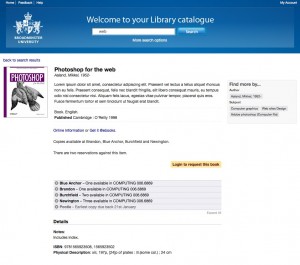
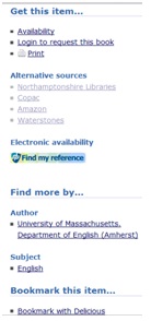
Where a resource is available electronically that is often the best route to follow. Electronic resources are often available right there in the browser, without having to find a physical copy on the shelves. The first statement on availability is the electronic availability statement. In the screenshot above you’ll see a very simple sentence giving the two links where the user might get hold of an electronic copy of the resource.
Next up is a simple statement of where physical copies can be found. In the example shown the sentence is “Copies available at Brandon, Blue Anchor, Burchfield and Newington.” which is a very simple, scannable sentence. This availability statement summarises where physical copies can be found.
The statement answers the questions “Are there copies available in all libraries or no copies at all at the moment?”. For those of you that have a large number of branches we don’t intend to overwhelm these statements with long lists of branches. The design include phrases like “Available at all branches except Newington and Pootle”, “Not immediately available at any branches” and “Copies available at all branches”. These phrases, like all in Prism 3, will be customisable. These statements increase the efficiency of the page by highlighting the key information. They’re the answer you could expect if you asked a librarian.
Having said that copies are available we know you don’t want your users surprised to find reservations preventing them getting the item later in the process. To alleviate this problem, the availability statement will be followed by a clear statement that there are reservations outstanding if this is the case.
As the reader continue down the page, knowing whether copies are available or not, the next item is a clear indication that they can reserve the item they’re looking at. This has been moved from its current position and highlighted to make the functionality more accessible. We will also be adding a configurable label for reservation pricing so you will be able to indicate any charges you make for reservations.

The key information; electronic and physical availability, reservations and how to reserve is all available before we get down to more specific detail. For those wanting more specific detail we sort this first by branch

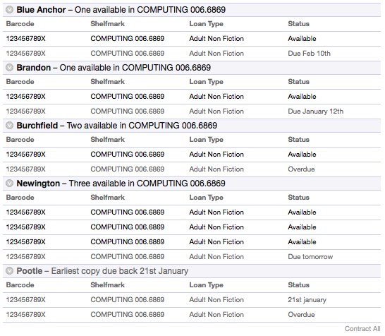
The use of simple statements continues here at branch level, a simple statement of how many copies are available, or when the earliest copy is due back if none are available. For those users in the library building we’ve also pulled the shelfmarks up into this statement, making it easier to see where to go next to find a copy. The branch names will be sorted alphabetically as this is the easiest way for a user to find a branch when scanning over the information.
By this point the majority of users have all the information they need to find a copy on the shelves in whichever branch they’re using. This is the objective we had for serving those first-time and infrequent users.
As we said at the start, though, we recognise that there are times when we need to add more detail for staff and expert users. Here we’re providing item level detail. To prevent information overload for the infrequent users this is hidden behind a single click of the branch name.

If you want to see all of the items in all of your branches, you’ll notice a discreet ‘expand all’ link at the bottom right corner of the table. Clicking this will expand all of the branches down to item level detail.
No design for availability would be complete without serious consideration for serials. The example above indicates the case for most items, but the useful data for serials is different. For serials the key information are the holdings, missings and notes. The new design for availability will display different data when working with availability for serials, showing this key information.

This design is a great improvement over the current display of availability and we’ll be doing the work to implement it shortly. As with all other aspects of Prism 3 what we’re showing here is the default, and deliberately plain, styling. You will be able to change the styling of these new features as you see fit to work with your own themes.
If you would like to talk to us about this more then comment below, email Alison Kershaw, talk to your account manager or come along to the next Talis Prism 3 Development Update Webinar on 8th March.



Recent Comments