I’m pleased to announce that a new version of Prism is now available for you to preview, together with a new release of the Admin Console.
Community Collaboration
This Prism release brings the first of the community collaboration features: user contributed star ratings.

The ability to rate an item gives the user a basic level of active participation in the catalogue, allowing them to express their response to an item. The display of ratings in the catalogue serves as a guide to other users in a way that is familiar from many other places on the web.
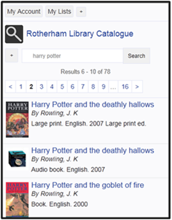
The average rating is displayed in results and in the item detail page. You can click on it to add your own rating – you are invited to login first, then taken back where you were. On the item detail page you also get a blank set of stars on an item yet to be rated.
Once logged in, ratings can be added on both the results page and the full detail page by clicking on the number of stars you wish to give the item. You can do this whether or not the item has been rated already. Ratings can also be altered if you change your mind at a later date – the new rating replaces an older rating to prevent any one user gaming the system.
We’re aggregating ratings across libraries in two groups: academic libraries and public libraries. All ratings in your library sector will be displayed in your catalogue, giving you the greater scope and refinement of the larger scale. The average rating for an item in a library sector is displayed.
This is just the first part of a larger scheme of work around adding community features to the catalogue which will include enabling users to see and manage their contributed content.
Ratings is an optional feature, allowing you to introduce it when you feel you are ready. We’ve added a new ‘Community Features’ section to the latest release of the Admin Console, also released today, which allows you to turn the feature on or off quickly and easily. To switch on ratings, under Community Features check the Enable ratings box and click the ‘Update’ button. You also need to reset the cache for your tenancy: in a new browser window or tab run your equivalent of this: prism.talis.com/demo/mytenancy-sandbox/resettenantcache.
We always recommend that you do this first for your sandbox tenancy. All Admin Console settings apply to both the preview and live environments, so when this release of Prism goes live, any tenancy where ratings are enabled will have the feature in the live service as well as in the preview.
Electronic Location Links
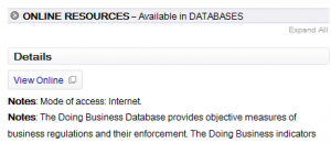
This release also brings a small change to the data model to improve our handling of Electronic Location and Access (856) fields. We’re ensuring that we extract the relevant information from the field, as well as tidying up how they are displayed on the item details page. This is the first part of a larger theme of work around improving access and discovery of e-resources within Prism.
Admin Console
The new release of the Admin Console brings several key improvements, including faster browsing of files in the theme section. We’ve also taken on board all of the feedback about improving the experience when you just want to 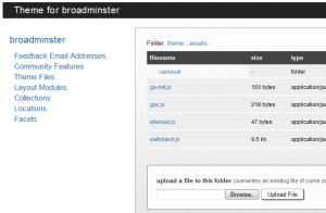 upload a single file and have remodelled this section to allow browsing through the folders that make up your theme, with uploads being stored in the folder you have active. Folders are marked as “folder” in the type column and can be navigated to by clicking on their name; a breadcrumb trail is provided to allow you to navigate back up the folder hierarchy. You cannot add or rename folders within the console: the folder structure must be created separately, zipped and uploaded – so if you’d like to add a new folder the best way is to download a theme backup, add the new folder (and files) and then use the upload zip function.
One further new area in the Admin Console is ‘Layout Modules’ allowing HTML5 rendering and the mobile interface to be enabled. If you’d like to enable the mobile interface, both of these need to be checked, but you can also just enable HTML5 if you want to take advantage of more modern web browser features without offering the mobile interface. These are both optional features as they can require a few tweaks to be made to your tenancy theme to ensure your design stays consistent. As with other features you can make adjustments in your sandbox before switching them on in your live tenancy. If you already have the Mobile interface enabled then both will be switched on by default, otherwise both will be switched off.
We’re planning on releasing these changes to the live service within the next week, so would really appreciate everyone trying these new features on their tenancy.
As usual, you can preview this release by inserting ‘/demo/’ after the prism.talis.com part of your URL and before the name of your tenancy, e.g. http://prism.talis.com/demo/mytenancy/. If you have your own host name, to see the preview you must use prism.talis.com/ instead. The preview enables you to search your live data and access your live Local Data Services (e.g. for availability, renewals and reservations) using the new version of Prism. You can also use it with your sandbox tenancy.
If you have any comments, questions or suggestions please get in touch; you can comment here on this blog, on the Prism forum and Prism Ideas or contact your account manager or the Prism team directly.



Recent Comments