University of Northampton Launches Prism 3 With Links to SFX and Public Library Holdings
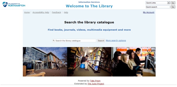
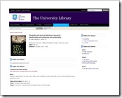
The Library and systems team at the University of Northampton have this week released their new Talis Prism 3 catalogue to students. They’ve provided a link from the library homepage here and are encouraging students to give them lots of feedback on it whilst they parallel run Prism 2 and Prism 3.
The University undertook their own design work and have tied it to the look and feel of the University brand – giving a seamless feeling for students using disparate library services.
Mike Aynsworth, Information Systems Manager, told me that “Prism 3 has been configured at the University of Northampton primarily for student resource discovery. We’ve used the Juice project to extend the catalogue to include links to COPAC, Waterstones, Amazon, SFX, Northamptonshire libraries and other useful alternative sources”.
 The links out to SFX are especially interesting, as the technical team at the University have utilised Juice to point students directly to the full text where it is available, and when not, it takes students to the SFX listings. The team are planning to further extend their alternative resources by adding in direct links to ebooks too.
The use of social media is incorporated too, with the option for students to bookmark searches with Delicious.
The team are also using the flexible design of the user interface to cater for the OPAC machines actually within the library, allowing for a more locked down “kiosk mode”.
To see the University of Northampton’s catalogue in action go to: http://prism.talis.com/northampton-ac

 The
The 

Recent Comments