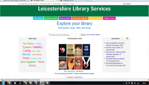
Leicestershire Libraries Live with Talis Prism 3
As my colleague, Imraz has reported in his most recent update, more libraries are starting to use Talis Prism 3 as either the main search interface or in parallel to the existing interface. A few, like Haringey have taken the plunge in a big way, and simply replaced the ‘old’ Prism 2.1 interface with the much more attractive Prism 3 look.
Towards the end of last week I was particularly struck by the latest library to launch their new interface, Leicestershire. Apart from the clean look and feel to the design, attractive book jacket images, and the single search box (all of which are becoming standard on the newer OPACs), I particularly liked the use of the additional information that has been included on the landing page. Firstly, there is  the tag cloud which directs users to a “Quick links section”. These links give a highly visual way for users to explore some recommendations, and even a link to Library Thing, via a Book Suggestor. The second area that I thought was interesting was the provision of local library news via a panel on the front page of the catalogue. This uses an RSS feed to give users a highly visible way of accessing the excellent Leicestershire Libraries Blog.
These additions to the interface are made possible using Juice extensions (for more information about Juice, please see here), and really enhance the look of the catalogue interface, and more importantly, provide users of the library services with the type of value added information that they expect from a website. It will be interesting to see what comments Leicestershire Libraries get from their users about Talis Prism 3.


Recent Comments