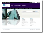
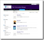
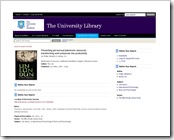
Prism design for Sheffield University
We’ve had great feedback on our Prism design for Sheffield. It’s work in progress and we expect changes as the team at Sheffield want to get to grips with using it. We’ve opted for a similar aesthetic to the current website so that the access is seamless when navigating from the library homepage. 


Click on the images for a larger view – tell us what you think.


Recent Comments