User Surveys and external data
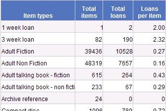
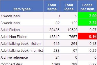
Tools like Talis Decisions are designed to work with existing data from the Talis Alto database. They cannot report on data that do not exist or that are not accessible. This doesn’t stop users from requesting reports on loans per library visit, percentage of visitors who didn’t find what they were looking for, the attendance at library events, or borrowers opinions on stock, study facilities or decor.
There are a couple of strategies that can be used where users want data of this kind
- Use of external data in Talis Decisions
- On-line surveys
We have already discussed on this blog the use of external data within Talis Decisions.
Surveys are an interesting area. They can be used in “pure” mode to capture borrower opinion. One example of this was mentioned in an earlier post on information and action. The same software can be used to record statistics that might otherwise be either recorded on paper or simply lost, such as the attendance at homework club in a public library, or a library event on citation software in an academic context.
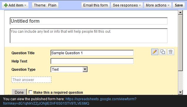 There are many on line survey tools, some of them free; Survey Monkey is one example which we have used ourselves in the past. If your organisation has a CRM (Customer Relationship Management) system then it may have built in survey facilities. Even Google Docs allows you to create forms and accumulate the responses in a Google Docs spreadsheet. For many purposes this would be quite adequate.
One word of caution however. It is easy for administrative and management staff to do so much data collection that computer use becomes a burden to front line staff. The National Health Service suffers greatly from this. The main purpose of computing is to reduce the time it takes to get a job done, but many nurses and doctors will tell you that in many cases computerisation has slowed them down rather than speeded them up (not in all cases – medical imaging and some laboratory systems are positive examples).

Recent Comments