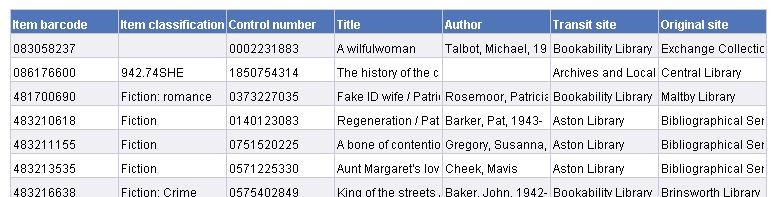
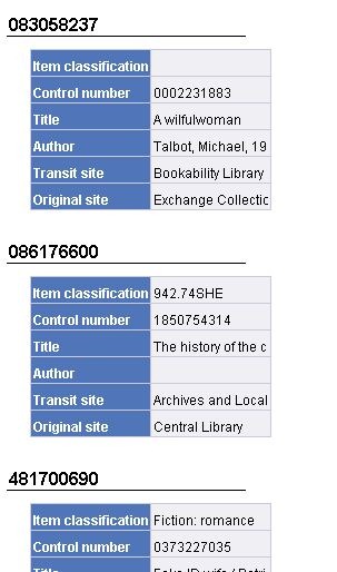
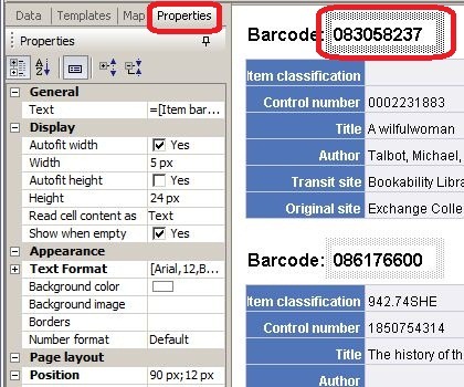
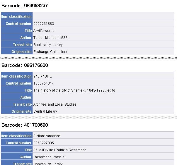
Prism 3 data in Decisions?
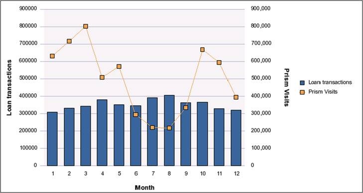 One of the items on the Decisions roadmap is to make a selected subset of Prism 3 usage data available in a Decisions Universe. Here is an example that displays Prism 3 visits alongside Loan data on the same chart (click the picture to see a larger version)
 Very extensive usage data is already available to all Prism 3 customers via Google Analytics: clearly there is little merit in attempting to reproduce all of that, but it may be helpful to have a few key metrics duplicated in Decisions. This may be useful when (as above) you want to display Prism usage alongside other library data (such as loan counts) on a single chart. It may also be useful for assembling routine reports such as month- or year-end where different aspects of library activity are consolidated into a single multi-tabular report.
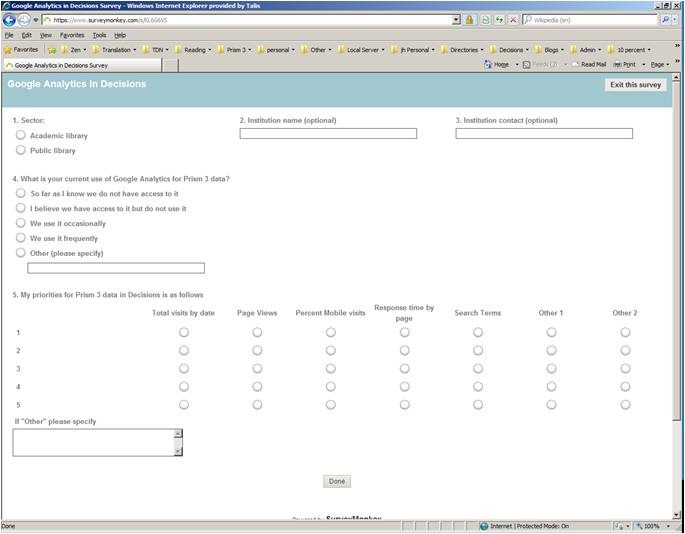 We would like to ask your help in understanding what Prism metrics (if any) you would find most useful in Decisions. We ran a webinar some weeks ago asking this question and a number of folk attended and kindly gave us feedback.
We would now like to throw the question open to everyone on the list. There is a one-page survey at:
https://www.surveymonkey.com/s/KL6G6VS – it will be open until 6th March.
We would be most grateful if you would spare a few minutes and take a look. If you don’t think it is a feature that you would use, that’s valid too; please email john.hardy@capita.co.uk directly or put something in the “notes” section of the survey.
Many thanks

Recent Comments