Decisions Blog

Dates and Times in Decisions

One frequent question in Decisions is date format. “Out of the box” Decisions may (depending on the PC’s settings) default to US date format (month-day-year) rather than the [dare I say more logical?] UK norm of day-month-year. This can cause frustration. Here are two examples of the same prompt in Web Intelligence, one with US settings and one with UK Settings. default date 2 default date

Note that the same date (9th May 2012) is selected on the calendar but the actual date displayed in the box is in different formats

There is a Solution on the Support website which explains this, but the key is to go into Preferences in Infoview. Preferences apply just to your own log-in/username and are accessed by clicking a link in the top right of the Infoview page:

                                default date 4

Within Preferences you can then select the “Preferred Viewing Locale”. Set this to English (United Kingdom), save your changes and that should do it.

                                                       default date 3

If it doesn’t, you may need to go further down the Preferences, click on the down arrow next to Web Intelligence and select Use my preferred viewing locale to format the data

Highlighting Exceptions

alerters1Decisions XI R2 offered a valuable facility for highlighting exceptions: Alerters. Alerters permit the report designer to highlight data which meets certain conditions. This makes it easier for an end user to pick out the handful of interesting cases from a mass of otherwise-normal data. In the example on the right, average times to satisfy cross-site reservations over 10 days are highlighted.


alerters2The alerter can be triggered by a comparison between two bits of data. In this example the number of loans per borrower is broken down by site, and the site names colour coded depending upon whether they are above or below average.


tracking 1Decisions XI R3.1 has a further facility to track changes in value through time. There are a number of selectable options: colours, formatting etc but also whether tracking is from a fixed point in time (say the start of a financial year) or since last refresh. This can be used to monitor values that you would expect to remain unchanged. Here for example is a short list of fund codes with their associated fund allocations. Tracking is switched on and has highlighted a row where the amount allocated has changed.

Prism 3 data in Decisions?

Sample ChartOne of the items on the Decisions roadmap is to make a selected subset of Prism 3 usage data available in a Decisions Universe. Here is an example that displays Prism 3 visits alongside Loan data on the same chart (click the picture to see a larger version)


Google Analytics LocationVery extensive usage data is already available to all Prism 3 customers via Google Analytics: clearly there is little merit in attempting to reproduce all of that, but it may be helpful to have a few key metrics duplicated in Decisions. This may be useful when (as above) you want to display Prism usage alongside other library data (such as loan counts) on a single chart. It may also be useful for assembling routine reports such as month- or year-end where different aspects of library activity are consolidated into a single multi-tabular report.


surveyWe would like to ask your help in understanding what Prism metrics (if any) you would find most useful in Decisions. We ran a webinar some weeks ago asking this question and a number of folk attended and kindly gave us feedback.

We would now like to throw the question open to everyone on the list. There is a one-page survey at:

https://www.surveymonkey.com/s/KL6G6VS – it will be open until 6th March.


We would be most grateful if you would spare a few minutes and take a look. If you don’t think it is a feature that you would use, that’s valid too; please email john.hardy@capita.co.uk  directly or put something in the “notes” section of the survey.

Many thanks

Transit Items

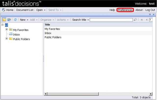
It’s been a while since I last posted: I’ve refrained whilst the switch between a “Talis” blog and a “Capita” blog has been going through. I’d like to restart with a worked example which illustrates some interesting issues.

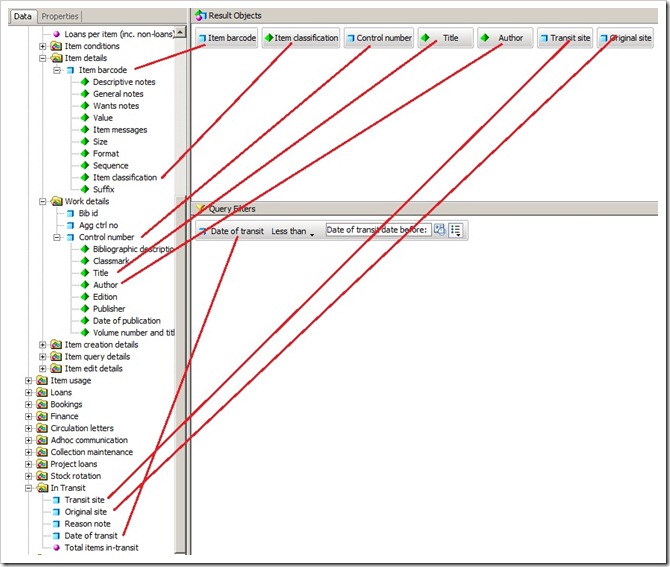
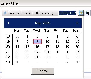
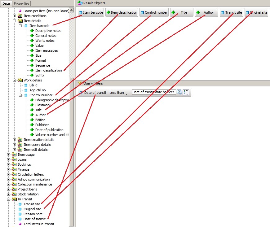
I was asked recently about a report of items that are In Transit and have been so since a specified date. This is on the face of it relatively straightforward. A query like this should do it:

transit query

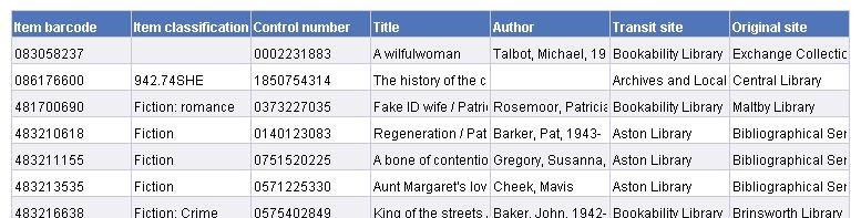
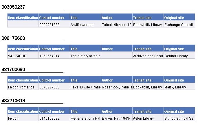
This produces a default report in tabular format:

transit default report

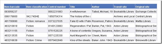
Apart from some resizing of columns, adjusting alignment and word wrapping, this looks close. And it is, in terms of data content.tranisit section context menu


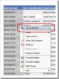
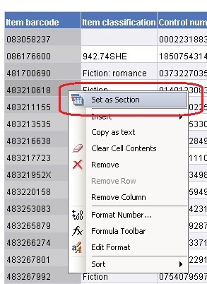
Not in format however. The person requesting the report wanted the output as one small vertical table by barcode, presumably because they were used to scanning data in this format. The first step is to section the report on barcode. A section is an area of the report where everything shares some characteristic: you might for example want to section a report on site, or month in year. There are several ways to create a section. If you already have a table which has the relevant column in it then the easiest way is to right click the column and choose “Set as Section”. In this example we are going to section on barcode.


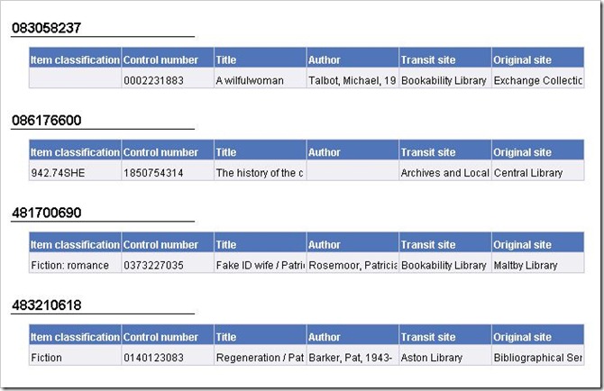
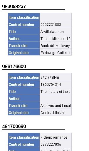
This has the effect of breaking the table up into one section per row with the barcode as a section header:

transit sectioned by barcode 

transit changing table type

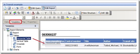
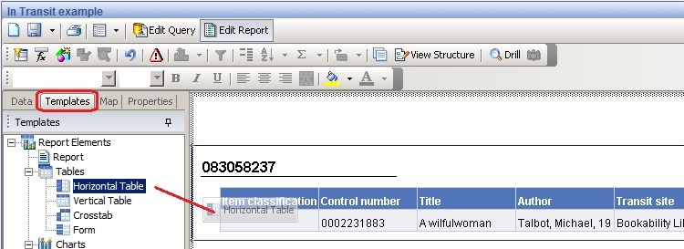
The final tweak is to turn the horizontal table into a vertical one. If you select the “template” tab in the left hand pane and navigate down into the “tables” folder you will find “Horizontal Table”. Drag this and drop it onto the existing table.


transit horiz table


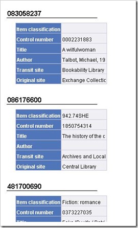
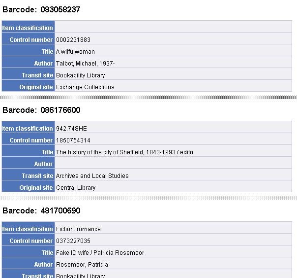
This will change the table style into what we want:


transit properties


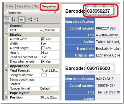
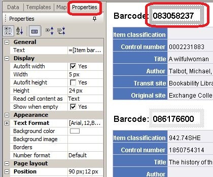
There are a few further changes we can make to tidy up the appearance of the report. The first thing is to drag the right hand edge of the table to give more space for the data. Secondly, the display of the Barcode is a bit messy with an underline far longer than the data. Visual tidying is mostly done in the “Properties” tab with the thing you want to change selected.


The end result after a little more tidying is below.  In this example I have

  • Turned off the barcode underlining (click on “Borders” in the properties tab)
  • Moved the barcode field across to the right
  • Inserted a blank text cell before it and typed “Barcode: “ into the cell
  • Right aligned the left hand column
  • Increased the width of the right hand column

transi horiz table tidied

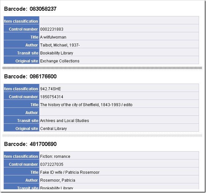
(Note: that the fuzzy grey line between sections is visible because the section boundaries were selected in the editor. They are not otherwise visible).

It is possible to nest sections. In my next post I’ll use this to illustrate sectioning this report on to/from sites.