Highlighting data in Talis Decisions
It is well said that the best place to hide a leaf is in a forest. It is all too common to miss important data in reams of print out. When you are designing reports, It is worth considering how to make it easier to home in on critical data. Here are two strategies:
Use a chart
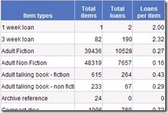
 Many users are keen to get actual numbers in tabular form, perhaps because they are required to report data in that form, or intend to do further manipulation in a spreadsheet. Here is an example. With some mental effort, it is possible to extract some useful information from the data. For example, it is clear from this example that non fiction is less well-used than fiction in both talking book and conventional book form. However, the data have to be read in detail and comparison done in the mind.
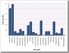
 One way to make the data stand out more immediately is to use a chart. This need not be an alternative to the table. Once a query has been set up to bring back data for a table, the same data can normally be used to populate a chart with very little extra effort. The chart can be put on the same report tab or on a separate report tab. Here is an example of a chart showing Loans per item against Item Type. Charts are particularly good at highlighting trends (e.g. loans through time) or outliers (the one site with an average time to satisfy a reservation that is much shorter or much longer than all the others).
Use Alerters
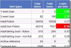
 In Talis Decisions, Alerters allow you to change the format (colours, fonts etc) in a table cell depending upon the data in the cell. This can be used to highlight data that has changed since last refresh, but in this context, it can be used to highlight outliers. One application for this is to embed Key Performance Indicators (KPIs) in alerters. In this example there is a minimum loans per item type KPI of 0.2. The loans per item for Adult Non Fiction is 0.16, so it is highlighted in red. You can have multiple alerters: to illustrate this, values > 1 have been highlighted in green, but in a real report there is often merit in keeping things simple.
If you have other strategies for helping users find their way through large volumes of data, please do add a comment.


Recent Comments