Data Visualisations
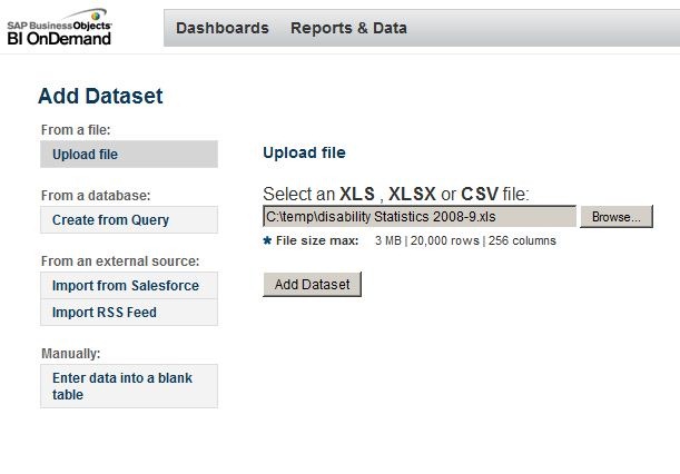
SAP (the company behind the BusinessObjects software that powers Talis Decisions) have a service available on the Internet called BI on Demand. A basic subscription (with limits on data volumes) appears to be free. This can sometimes be useful to experiment with visualisation of Excel data. Creating a visualisation from an Excel spreadsheet is a straightforward process:
- Log in
- Upload the spreadsheet
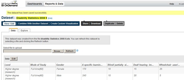
- The system does its best to sort out the data and you can then view and amend a default visualisation in the “Explore” tab:
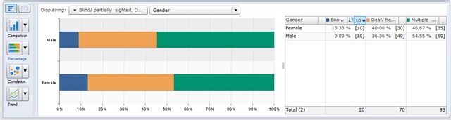
The visualisation is highly dynamic: it changes almost instantly with changes in the drop-downs.
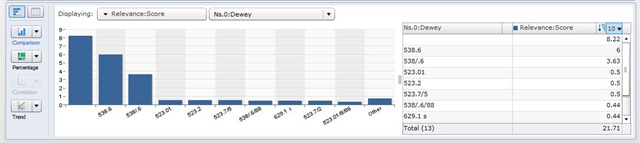
The other thing about this service however is that it can use a query on the Talis Platform directly so that for example it is possible to generate visualisations of Talis Prism 3 or Talis Engage data directly from the underlying store. Here for example is a visualisation of the frequency of occurrence of various Dewey values in the top 50 items in the library catalogue containing Magnetohydrodynamics in the title:
It isn’t a complete answer to visualising data – but in some circumstances it may be another option to consider.

Recent Comments