Web Based Visualisation Tools
There are an increasing number of free or low cost data visualisation tools available on the web. that can be used right away – i.e. do not require downloading and installing software.
In my last post for example, I mentioned SAP BusinessObjects BI OnDemand (Sap BusinessObjects supply the underlying platform for Talis Decisions). This allows upload of data from spreadsheets or web-based data feeds (such as a query on the Talis Platform) and is geared towards the graphing and charting of data
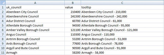
Another tool which takes a similar approach but has a very different output is Open Heat Map. This is a simple Geographical Information System. It is limited in scope but is very simple to use if you have the correct data. Here for example is a set of data on UK Council populations (taken from one of Open Heat Map’s example data sets – the data values have not been verified):
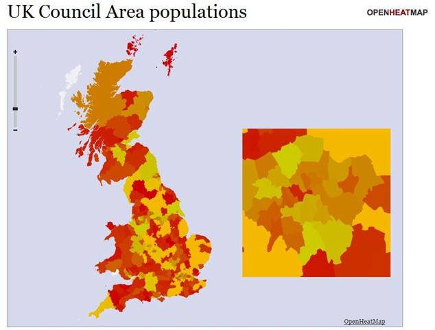
And here is the same data visualised in Open Heat Map:
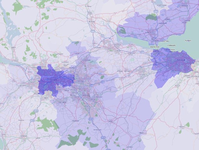
…and here is a more detailed example based on the same data – zoomed in on the central area of Scotland and transparency adjusted to allow us to see the underlying map:
If the “values” column in the spreadsheet were to be replaced by (say) average loans or library membership per 1000 population, this could be used for displaying comparative library data.
The tool has limitations: in particular it can only map kinds of data that it knows about such as UK councils and Irish county codes The data types currently recognised are available here: at the time of writing they do not include UK Postcode Outward Code. If they did, then it would be possible to produce a visualisation of loan or borrower density from a fairly simple Talis Decisions query in a matter of seconds. How cool is that?

Recent Comments