Decisions Blog

User Surveys and external data

Tools like Talis Decisions are designed to work with existing data from the Talis Alto database. They cannot report on data that do not exist or that are not accessible. This doesn’t stop users from requesting reports on loans per library visit, percentage of visitors who didn’t find what they were looking for, the attendance at library events, or borrowers opinions on stock, study facilities or decor.

There are a couple of strategies that can be used where users want data of this kind

  • Use of external data in Talis Decisions
  • On-line surveys

We have already discussed on this blog the use of external data within Talis Decisions.

Surveys are an interesting area. They can be used in “pure” mode to capture borrower opinion. One example of this was mentioned in an earlier post on information and action. The same software can be used to record statistics that might otherwise be either recorded on paper or simply lost, such as the attendance at homework club in a public library, or a library event on citation software in an academic context.

Google Docs forms There are many on line survey tools, some of them free; Survey Monkey is one example which we have used ourselves in the past. If your organisation has a CRM (Customer Relationship Management) system then it may have built in survey facilities. Even Google Docs allows you to create forms and accumulate the responses in a Google Docs spreadsheet. For many purposes this would be quite adequate.

One word of caution however. It is easy for administrative and management staff to do so much data collection that computer use becomes a burden to front line staff. The National Health Service suffers greatly from this. The main purpose of computing is to reduce the time it takes to get a job done, but many nurses and doctors will tell you that in many cases computerisation has slowed them down rather than speeded them up (not in all cases – medical imaging and some laboratory systems are positive examples).

Highlighting data in Talis Decisions

It is well said that the best place to hide a leaf is in a forest. It is all too common to miss important data in reams of print out. When you are designing reports, It is worth considering how to make it easier to home in on critical data. Here are two strategies:

Use a chart

Alert 1 Many users are keen to get actual numbers in tabular form, perhaps because they are required to report data in that form, or intend to do further manipulation in a spreadsheet. Here is an example. With some mental effort, it is possible to extract some useful information from the data. For example, it is clear from this example that non fiction is less well-used than fiction in both talking book and conventional book form. However, the data have to be read in detail and comparison done in the mind.

Alert 2 One way to make the data stand out more immediately is to use a chart. This need not be an alternative to the table. Once a query has been set up to bring back data for a table, the same data can normally be used to populate a chart with very little extra effort. The chart can be put on the same report tab or on a separate report tab. Here is an example of a chart showing Loans per item against Item Type. Charts are particularly good at highlighting trends (e.g. loans through time) or outliers (the one site with an average time to satisfy a reservation that is much shorter or much longer than all the others).

Use Alerters

Alert 3 In Talis Decisions, Alerters allow you to change the format (colours, fonts etc) in a table cell depending upon the data in the cell. This can be used to highlight data that has changed since last refresh, but in this context, it can be used to highlight outliers. One application for this is to embed Key Performance Indicators (KPIs) in alerters. In this example there is a minimum loans per item type KPI of 0.2. The loans per item for Adult Non Fiction is 0.16, so it is highlighted in red. You can have multiple alerters: to illustrate this, values > 1 have been highlighted in green, but in a real report there is often merit in keeping things simple.

If you have other strategies for helping users find their way through large volumes of data, please do add a comment.

Google Tools

A few days ago I mentioned a webinar on Google Analytics. Goggle Analytics (or “GA” for short) is a powerful and free tool for tracking website traffic.

GA1

It is widely used with the web-based Talis products such as Prism 3 and Engage. It offers all sorts of unexpected detail such as the browser used and connections from smart phones.

Google has a number of other tools which can be useful in a library context

Books NGram Viewer

This is not directly management information although it might be a good source of quirky facts for illustrating annual reports! You may also need to exercise some discretion on who you tell about this. To anyone with an interest in social history it is enormously compelling and it is easy to waste hours playing with it: but for some Subject Librarians it could be very helpful.

Ngram1 Google Books Ngram viewer allows you to plot the frequency of occurrence of a word in literature through time. You can pick your date range, the corpus of books (e.g. American, British) and the words that you want to plot. Here for example is a plot showing the meteoric rise of the words “environment” and “environmental” in British English since 1960.

It works in many languages too. Here is a search of simplified Chinese literature on the word 飞机 (“aircraft”) since 1940.

Public Data Explorer

This has two parts. Firstly a number of data sets are available for browsing which might be useful in benchmarking. Here for example is broadband penetration for selected countries (note time slider along the bottom), and here is the same data as a graph through time. This might for example be helpful in interpreting usage stats for people’s network PC. A list of some of the data sets available is here.

The second part is uploading your own data. This is not wholly straightforward (it involves writing some XML) but it is possible to load your own data sets: http://www.google.com/publicdata/admin (you need to have a Google account and be logged in to see this)

Google Moderator

Possible applications in canvassing user feedback. See http://www.google.com/moderator/#0

Google Docs

This allows you to store spreadsheets and other documents in the cloud and grant access to others. You can also publish them as web pages on line – see http://docs.google.com. The latter is particularly powerful: if you have data that you want to make available to a wide audience, publish as HTML and send your audience the link.

Technorati Tags: ,

Google Analytics webinars

I’ve mentioned Google Analytics in a number of earlier posts. The principle is simple: detailed statistics about visits and visitors to web pages: how many, from whereabouts, even whether access is by smartphone or from a PC – and far more besides.

As more and more service move to the web, tools like this become critical to answer questions like:

  • Capture Are you spending a lot of time maintaining web pages that are never used?
  • Was a publicity campaign aimed at driving traffic to particular places on the website actually effective?
  • Are people continually searching for things you don’t have?
  • Is it worth taking the time to develop a version of a page optimised for smartphones or tablets?

Capture Talis run regular webinars on Google Analytics for those who want to understand a bit more about it. This is of particular benefit to customers using Prism 3 or Engage but is equally useful for anyone with more general responsibility for library web presence.

As I write, the next course is 9th March. You can see a list of such courses here. There is also a (brief) course overview available on the website.

The big picture – Gartner’s “Magic Quadrant”

I’ve mentioned the Gartner group before: they are a highly respected albeit commercial research organisation specialising in IT-related areas.

Gartner publish a regular overview of Business Intelligence tools under the heading of the “Magic Quadrant”. The latest report (published at the end of January) is here. This is an industry-wide report (all kinds of organisations, not just libraries): but it is sometimes useful to peep over the fence and see how other organisations are faring in this field.

It is encouraging to note that “…SAP BusinessObjects’ [the software that powers Talis Decisions] reporting and ad hoc query capabilities were defined by its customers to be its top strengths…”, and that SAP remains amongst the handful of leaders in this field.

Universe Objects in Talis Decisions

poole 1 Last week I was looking at a Talis Decisions report problem: some results were returned but they were wildly inaccurate. In the end it turned out to be a fairly simple issue: the wrong object had been used in the report: "Home Site" (i.e. the borrower’s home site) was being used instead of "Item Home Site".

This kind of mistake is easy to make: clearly every object has to have a unique name so occasionally object names have to be chosen to be unique rather than purely for clarity in the context. Also if later on experience suggests an improvement in naming, this is difficult to do because changing the name of an object breaks all the reports that use it. Every object does however have pop-up help associated with it (just hover over the object), so if you get odd results from a query one of the first things to check is the pop-up help just to make sure that you have the right objects.

Object Help

There are also situations where what really is the same thing pops up in two places: an example is Item sequence and Sequence Where this occurs, the difference is often between whether the results are inclusive or exclusive (i.e. all items, with Sequence if they have one; or just those items that have a Sequence). This issue is covered further on the Exploring the Talis Decisions Universes webinar.

Information and Action

Blog_scratch 2_3142_image001

The real test of the usefulness of Management Information is the action you can take on the basis of it, or what learning you take from it that in turn may lead to action. A customer (Queen’s University Belfast)  recently ran a student survey at one of their libraries and on the basis of this re-located some self-service terminals. This was the impact of the change on self-service terminal usage (note that figures for July 2009 are interpolated).

Surveys are a form of Management information, and this one didn’t just produce “Fancy that” information. It produced results that could be (and in this case, were) put into action. The subsequent monitoring of results closed the loop. If (in the absence of any other change) transactions had fallen rather than climbed, the terminals could have been moved again either to somewhere else or even back to their previous locations.

This was an example of good practice, but there are far too many examples of wasted effort in the Management Information world. Information is expensive to collect, collate, present and (an often overlooked point), expensive to absorb. You can waste end-users time (and therefore by implication, the institution’s money) by sending them heaps of data that they can neither learn from, nor take action on. Furthermore, a mass of information presented in different reports at different intervals can hide the important stuff as surely as a forest can hide a leaf or a blizzard a snowflake. Before you specify a report or decide on a data-collection exercise, it is always worth pondering what actions are available to you when you get the output.

Overdues and FOI requests

Several universities have told us that they have had what sounds like the same Freedom of Information (FOI) request from a national newspaper. Most of the data requested are easy to extract using Talis Decisions but one area is statistics on historical overdues. Data on current Overdue are easy to extract using Talis Decisions, but the need to extract detailed data on historical Overdues was not envisaged. This raises some interesting issues of principle:

  • How should permanently lost items be accounted for? Without some thought here, the statistics are likely to reflect items most commonly lost or stolen rather than those which are eventually returned.
  • Should the data be at the level of individual item or barcode (e.g. this particular instance was most commonly overdue), at the level of an individual catalogue record (Bib ID) or even at the level of all editions (e.g. all editions of “Macbeth”)
  • Should all types of Loan and all types of Item be included? What about home delivery, books on prescription and all those edge cases?

Illustrated below is one example of a possible approach to this problem. The assumptions made are that:

  • Data should be accumulated at the level of Control Number (i.e. catalogue record)
  • Overdues above a particular threshold should be excluded
  • Certain item types should be excluded

The queries

There are many ways to organise this. In the example report created for this, I reported on Fines as well and used four queries, merging the results . Only two are needed for the Overdue report. These are discussed below
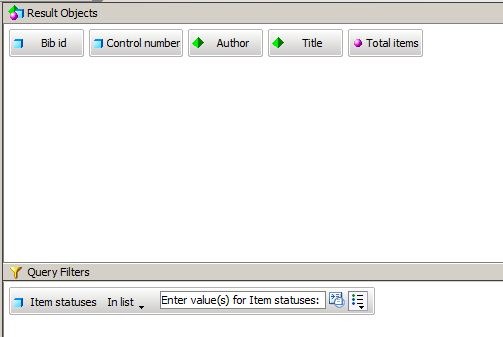
Bib Data

This query brings back the Bibliographic Data Author and Title for the items that you want to include:

FOI 1

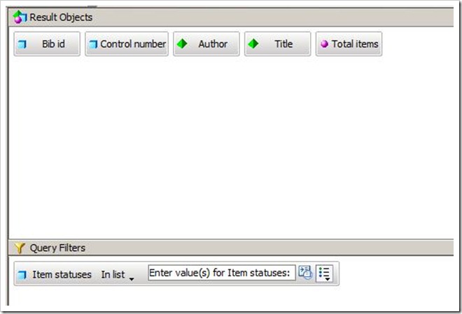
The list is limited by Item Status as a prompt, in part to reduce query execution time by (for example) excluding redundant items.
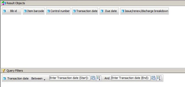
Overdue Items

This is the most complex query. It brings back the Transaction Date and the Due Date by Item Barcode. These data are used to calculate aggregate overdues:

FOI 2

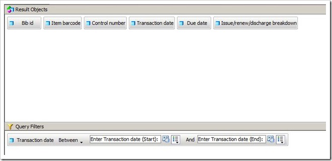
Note the prompt limits on Transaction date. Without limits on the date range, this query could run for a very long time. A further filter could be used to bring back only discharge transactions.

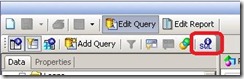
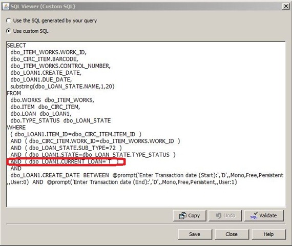
As it stands, this query only brings back current overdues. The generated SQL must be modified to bring back all overdues. To do this, proceed as follows:

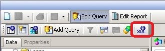
Click on the SQL button on the control bar in this query:

FOI SQL Button

This will open up a window which allows you to modify the SQL. Delete the line ringed in red:

FOI 4a

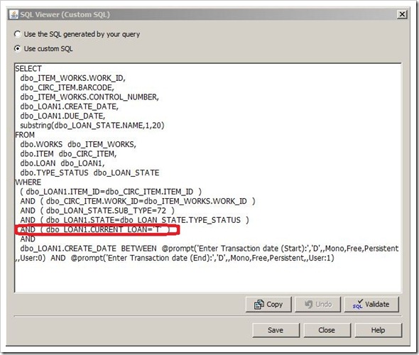
NB: if you make any changes to this query (including filters) the SQL is regenerated and this step must be repeated

Once these queries are produced the report can be run

Variables

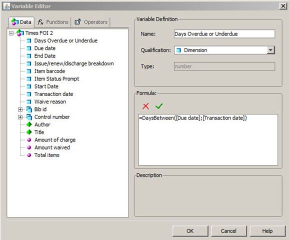
To transform the raw dates into an elapsed overdue days, I used a variable thus:

FOI 11

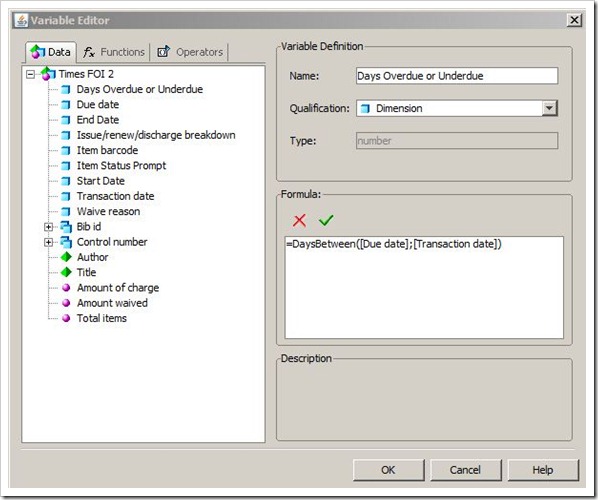
The Formula used is: =DaysBetween([Due date];[Transaction date]). This calculates the number of days between the due date and transaction date for each item.

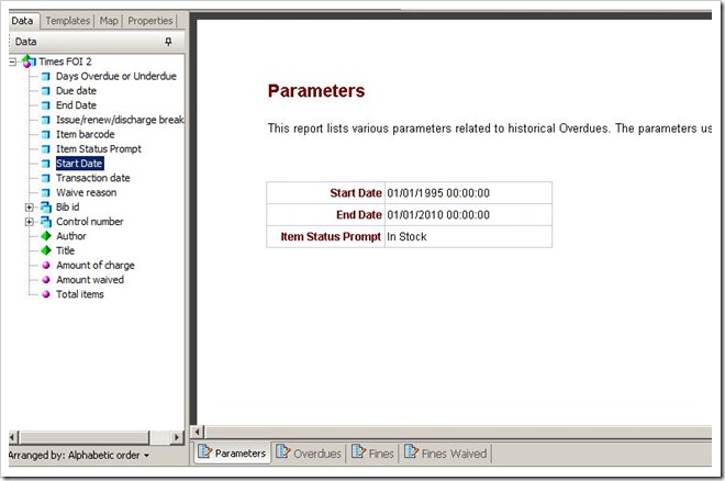
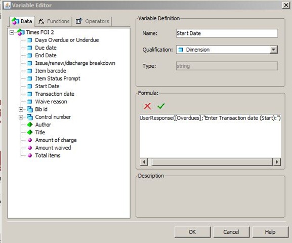
I also used variables to calculate and display parameters. Here is an example for a variable I called End Date (this displays the transaction end date used in the prompts in the most recent refresh of the report:

FOI 12

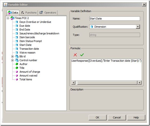
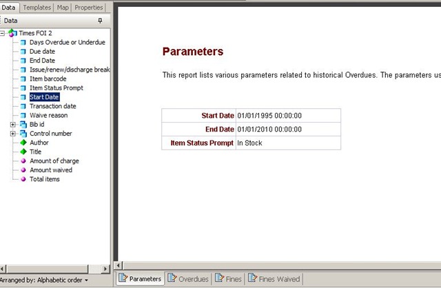
This uses the UserResponse function. Note that you may need to include the optional Query Name (“Overdues”) in this example if you are using the same prompt text in multiple queries as described earlier. This allows you to create a report page which documents the parameters used in the report thus:

FOI 7

Reports

This should give you the data that are needed to create the reports that you need. Two other ideas might be helpful:

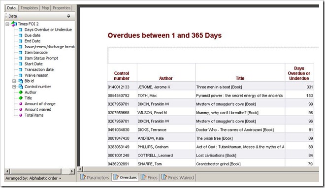
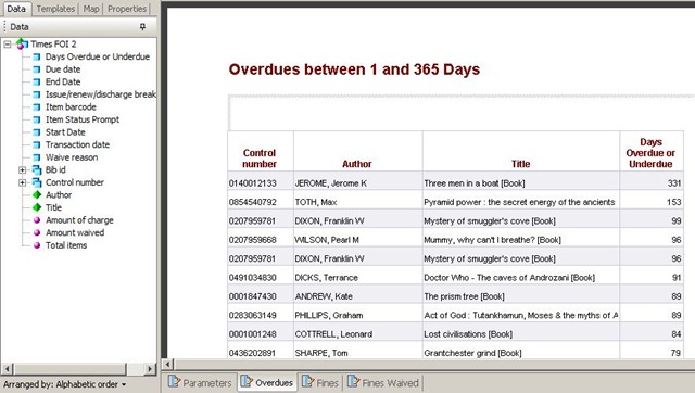
  • You can use a Report filter (as opposed to a Query filter) to restrict the Days Overdue or Underdue to a range  (say 1 – 365) to filter out those where the item has been returned before the due date and also those that will almost certainly never be returned.
  • If you right click the Days Overdue or Underdue column in a report you can sort it descending

These features are illustrated in this sample report:

FOI 8

In Conclusion

If this has been helpful, please email me directly, or comment below. If you would like a BIAR file containing an example report, please email me.
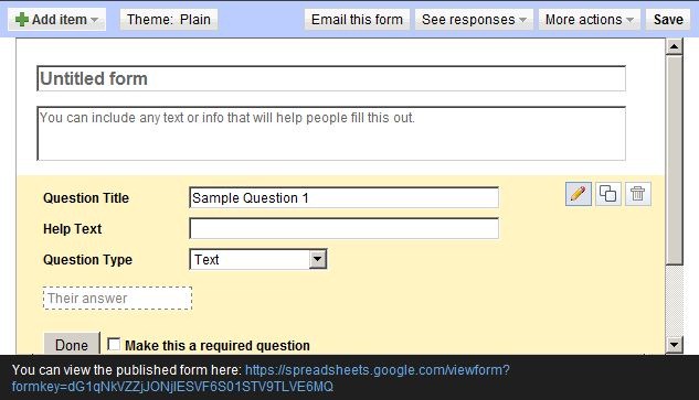
Technorati Tags: ,,

More on Google Analytics

I have blogged before on Google Analytics, but for anyone who still finds it a bit of a mystery, here are some links which explain it further:

  • A video by Karen Reece (available from the Talis Prism 3 site web site) explaining how Google Analytics works with Talis products. A good introduction
  • The Google Analytics blog is geared towards commercial operations (such as e-commerce) but with a little imagination the same principles can be adapted to libraries. You may not be interested in which shirt you are selling most of, but the popular titles on your home page getting the most clicks are surely of interest to acquisitions staff. Here for example is one of Google’s recent innovations – click frequency overlaid on a view of your site (this is the Juice site but the same approach works with Talis Prism 3, Aspire etc.).
    juice1
  • There is a very good item in the Prism 3 blog
  • And another video on the Talis Aspire website.

I trust that these are useful. As the use of Software as a Service (SaaS) applications grows, tools like Google Analytics become an increasingly important adjunct to more traditional reporting of transactions.

Web Based Visualisation Tools

There are an increasing number of free or low cost data visualisation tools available on the web. that can be used right away – i.e. do not require downloading and installing software.

In my last post for example, I mentioned SAP BusinessObjects BI OnDemand (Sap BusinessObjects supply the underlying platform for Talis Decisions). This allows upload of data from spreadsheets or web-based data feeds (such as a query on the Talis Platform) and is geared towards the graphing and charting of data

Another tool which takes a similar approach but has a very different output is Open Heat Map. This is a simple Geographical Information System. It is limited in scope but is very simple to use if you have the correct data. Here for example is a set of data on UK Council populations (taken from one of Open Heat Map’s example data sets – the data values have not been verified):

UK Council Populations1

And here is the same data visualised in Open Heat Map:

UK Council Populations

…and here is a more detailed example based on the same data – zoomed in on the central area of Scotland and transparency adjusted to allow us to see the underlying map:

UK Council Populations2

If the “values” column in the spreadsheet were to be replaced by (say) average loans or library membership per 1000 population, this could be used for displaying comparative library data.

The tool has limitations: in particular it can only map kinds of data that it knows about such as UK councils and Irish county codes The data types currently recognised are available here: at the time of writing they do not include UK Postcode Outward Code. If they did, then it would be possible to produce a visualisation of loan or borrower density from a fairly simple Talis Decisions query in a matter of seconds. How cool is that?